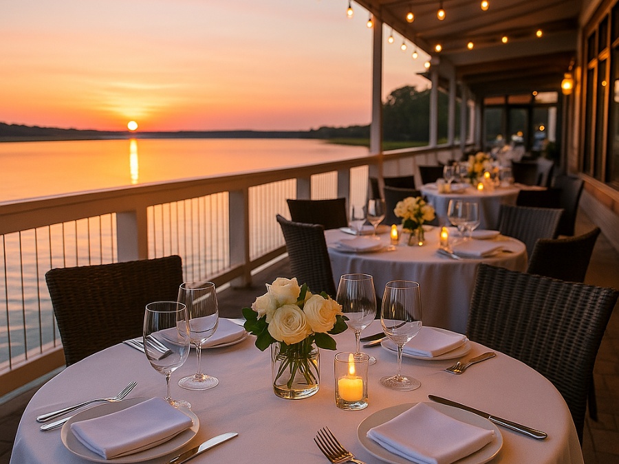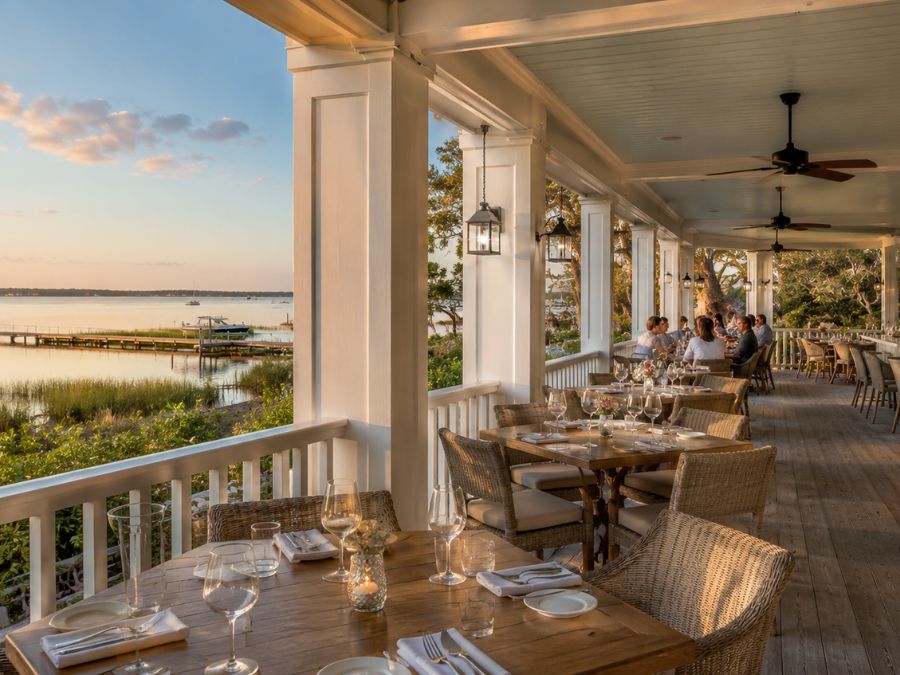
Some waterfront restaurants feel right before the first drink hits the table.
It might be the way the porch ceiling softens the light, the way the trim frames the marina beyond the windows, or the way a weathered neutral wall lets a plate of seafood and a sunset do the talking. Guests may not walk in thinking about paint color. They are usually thinking about the view, the menu, the breeze, the reservation, or whether they can get a table near the water.
Still, color is already working.
In a waterfront dining space, paint is part of the mood. It shapes how bright the room feels at lunch, how intimate the bar feels after dark, how fresh the patio looks in photos, and how naturally the restaurant seems to belong beside the water. The best color choices do not announce themselves. They make the whole experience feel easier.
On Hilton Head, where dining often comes with marsh views, marina traffic, porch seating, salt air, and Lowcountry light, the atmosphere begins long before the server arrives.
The View Is Not the Only Thing Guests Remember
A waterfront restaurant always has one major design advantage: the setting. Water, boats, docks, marsh grass, live oaks, and evening light already give the meal a sense of place.
But a view still needs a frame.
Paint color helps decide whether the room supports that view or competes with it. A wall color that is too bright can feel harsh against glare off the water. A shade that is too dark can make a dining room feel heavy during the day. A trim color that feels neglected can make the whole space seem less polished, even if the view is beautiful.
The strongest waterfront restaurants understand restraint. They do not try to outshine the scenery. They use color to make the scenery feel more present.
Soft whites, oyster tones, weathered grays, muted greens, washed blues, and warm natural shades often work because they feel connected to the surrounding landscape. They echo dock boards, shells, sky, marsh, water, and shade without turning the restaurant into a theme.
Color Changes the Pace of the Meal
Every dining space has a rhythm.
A bright casual seafood spot should not feel like a formal dinner room. A sunset cocktail bar should not feel like a breakfast café. A family friendly deck, a marina side lunch spot, and a quiet date night dining room all need different emotional cues.
Paint color helps create those cues.
Lighter colors can make a restaurant feel open, breezy, and relaxed. Deeper tones can make a bar feel more grounded in the evening. Soft greens and blues can calm a room without making it feel sleepy. Warm neutrals can make a dining space feel comfortable even before it fills with conversation.
Guests may not describe it in design language. They simply know whether a place feels like somewhere to linger or somewhere to leave quickly.
That feeling matters in waterfront dining. People are often there for more than a meal. They are there for the light, the pace, the view, the company, and the chance to sit somewhere that feels different from everyday life.
Coastal Color Works Best When It Avoids the Obvious
There is always a temptation to make waterfront restaurants look aggressively coastal.
Blue walls. White trim. Rope accents. Shell art. Bright coral details. A sign with a fish on it.
Sometimes those choices work. More often, the most memorable spaces are quieter. They borrow from the coast without copying it too literally. They use oyster shell instead of stark white, marsh green instead of novelty turquoise, faded indigo instead of loud navy, tabby gray instead of flat beige, and warm wood tones instead of decorative nautical props.
The island is already outside the window. It does not need to be repeated on every wall.
A good palette leaves room for the real color of the experience: a basket of hush puppies, a glass catching sunset light, shrimp on a plate, the movement of boats behind the bar, or the glow that arrives just before dusk.
The room should not fight those moments. It should hold them.
Porches, Ceilings, and Railings Set the First Mood
In waterfront dining, the outdoor spaces often matter as much as the dining room.
Guests notice the entry path. They notice the porch. They notice the railing they lean against while waiting for a table. They notice whether the stairs feel fresh, whether the host stand looks cared for, whether the patio ceiling feels finished, and whether the bar area has been maintained through a long season.
Porch ceilings deserve special attention. A pale blue or blue green ceiling can feel rooted in Southern coastal tradition without becoming overly decorative. A soft white can make the space feel crisp and open. A deeper shade can make a covered bar or evening patio feel more intimate.
Railings and trim have their own effect. Clean paint makes outdoor spaces feel intentional. Faded or peeling edges can make a restaurant feel tired before the food has a chance to impress anyone.
This is where paint becomes part of hospitality. It is not just what guests see. It is what they touch, lean on, photograph, and remember.
Salt Air Is Part of the Atmosphere Too
Waterfront restaurants have to live with the setting that makes them appealing.
Salt air, humidity, sun, rain, and heavy foot traffic all leave marks over time. Doors get handled constantly. Railings take sun and moisture. Patio surfaces deal with weather and guests. Bathrooms, host stands, bar fronts, and trim see more use in one busy season than some residential spaces see in years.
A color can be beautiful, but the finish still has to hold up.
Professional painting companies such as Simon Painting often look at painted spaces through both a design and durability lens. In coastal or high-use environments, the question is not only which color feels right, but whether the finish can hold up through a full season of salt air, sun, cleaning, and constant use.
For diners, that practical work should disappear into the experience. They should not be thinking about paint, trim, or finish quality. They should simply feel that the space is fresh, cared for, and comfortable enough to enjoy the meal.
The Bar Often Carries the Room
At many waterfront restaurants, the bar is the visual anchor.
It is where guests wait for a table, order a first drink, talk with locals, watch the water, or settle in after a beach day. The color around the bar can shift the whole mood of the restaurant.
A darker bar can feel classic and grounded. A weathered green or blue can feel relaxed without becoming too literal. A warm neutral can keep the view and the drinks in focus. A richer accent can give the room energy after sunset.
The bar also shows wear quickly. Guests lean on it. Staff move around it constantly. Stools scrape. Glasses leave rings. Hands touch the same painted edges again and again. A bar that looks cared for sends a quiet signal that the rest of the restaurant is cared for too.
Guests Feel Maintenance Before They Notice It
Most diners do not study walls, trim, and ceilings on purpose. But they do absorb the condition of a space.
Fresh paint can make a restaurant feel cleaner, calmer, and more welcoming. It can make an older dining room feel current without changing the view or the menu. It can help a casual patio feel more polished and a formal dining space feel less stiff.
Worn paint has the opposite effect. Scuffed doors, chipped trim, faded railings, stained walls, or a tired entry can make a restaurant feel neglected, even when the food is excellent.
In a place like Hilton Head, where waterfront meals are often tied to vacations, celebrations, family visits, and sunset memories, atmosphere carries real weight. Guests remember how the space made them feel.
A Guest’s Guide to Reading Waterfront Restaurant Atmosphere
The next time you walk into a waterfront restaurant, pay attention to how the space feels before you look closely at the menu. A few design details often explain why some places feel easy to settle into while others feel slightly off.
The Best Waterfront Spaces Let the Setting Lead
A memorable waterfront restaurant does not need every surface to shout “coastal.” The water already does that. So do the boats, the marsh grass, the breeze, the seafood, the porch, and the light moving across the table.
Paint works best when it gives those details a place to land.
The right color can make a dining room feel cooler after a hot afternoon, make a patio feel more relaxed at sunset, or make a bar feel warmer once the evening crowd settles in. It can turn a simple meal into something that feels more connected to where you are.
On Hilton Head, the best waterfront dining spaces often have that quality. You may remember the shrimp, the view, the conversation, or the way the sky changed while you were eating. But somewhere in the background, the room helped hold the moment together.